Tearsheets
Creating content to fit a layout is one of the more challenging aspects of my role as a photographer and content creator. Sometimes we get to photograph or record a scene as the story unfolds, however, it’s more common that we are sent out to create images to fit a certain space on a page, or a certain aspect ratio for a phone or device where social media is consumed. I learned how to shoot a lot of options to allow for space for mastheads and headlines, captions or titles and sub-titles. Not only that, shooting video is crucial on every job, but also shooting some vertical video, helpful to engage viewers on Instagram Stories or Snapchat, for example.
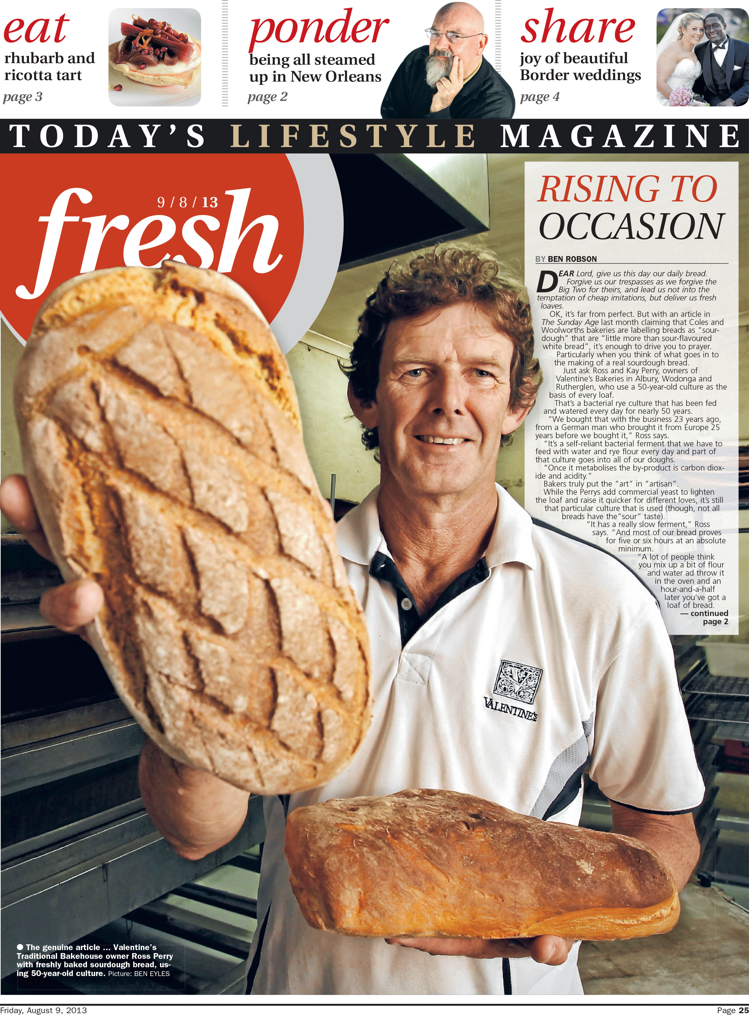
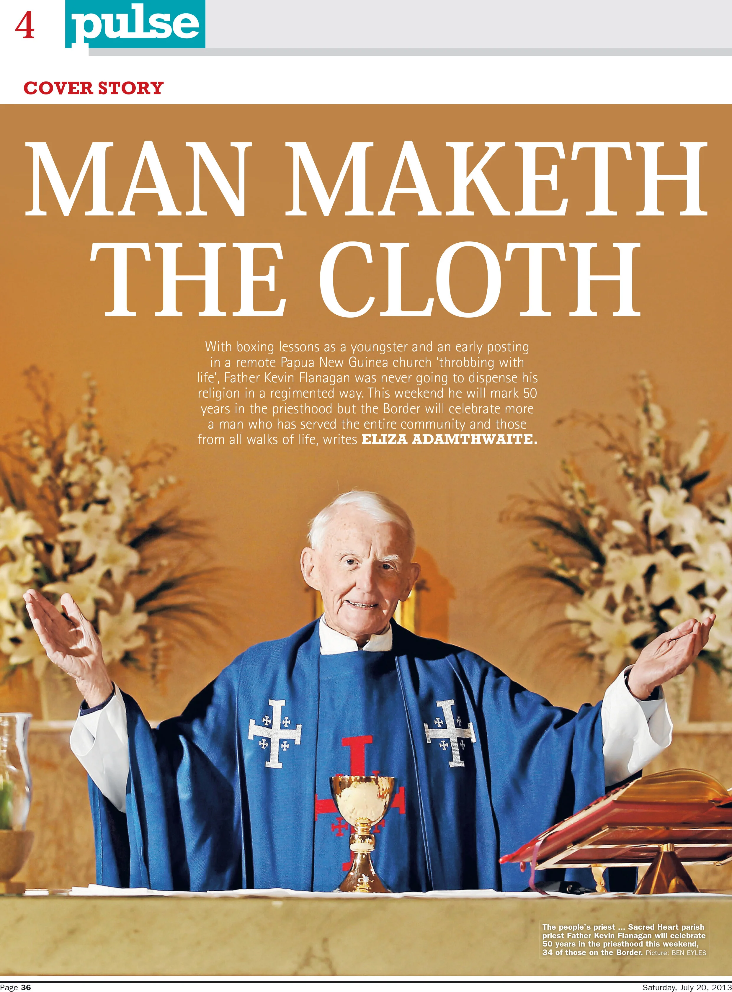
The following layouts represent some of my favourite work at the Border Mail. Telling these stories was a labour of love of mine, as it took months of work in between an otherwise full workload of news jobs to arrange these interviews and portrait sessions. Further to that, this was the first time I was allowed to write all the articles — which ended up being the lead topic for the Saturday weekend section, no less. I’d written plenty of words for newspapers before this, of course, but at the Border Mail in 2011, the idea of a photographer typing out copy, let alone the lion’s share of the weekend section, as well as illustrate it, was pretty new. A number of these images were very technically taxing to create, the page 3 shot below, was a long exposure shot mixed with strobe. It took two helpers to hold flashes and a lot of patient manual lens focussing to create this shot in an utterly black room.
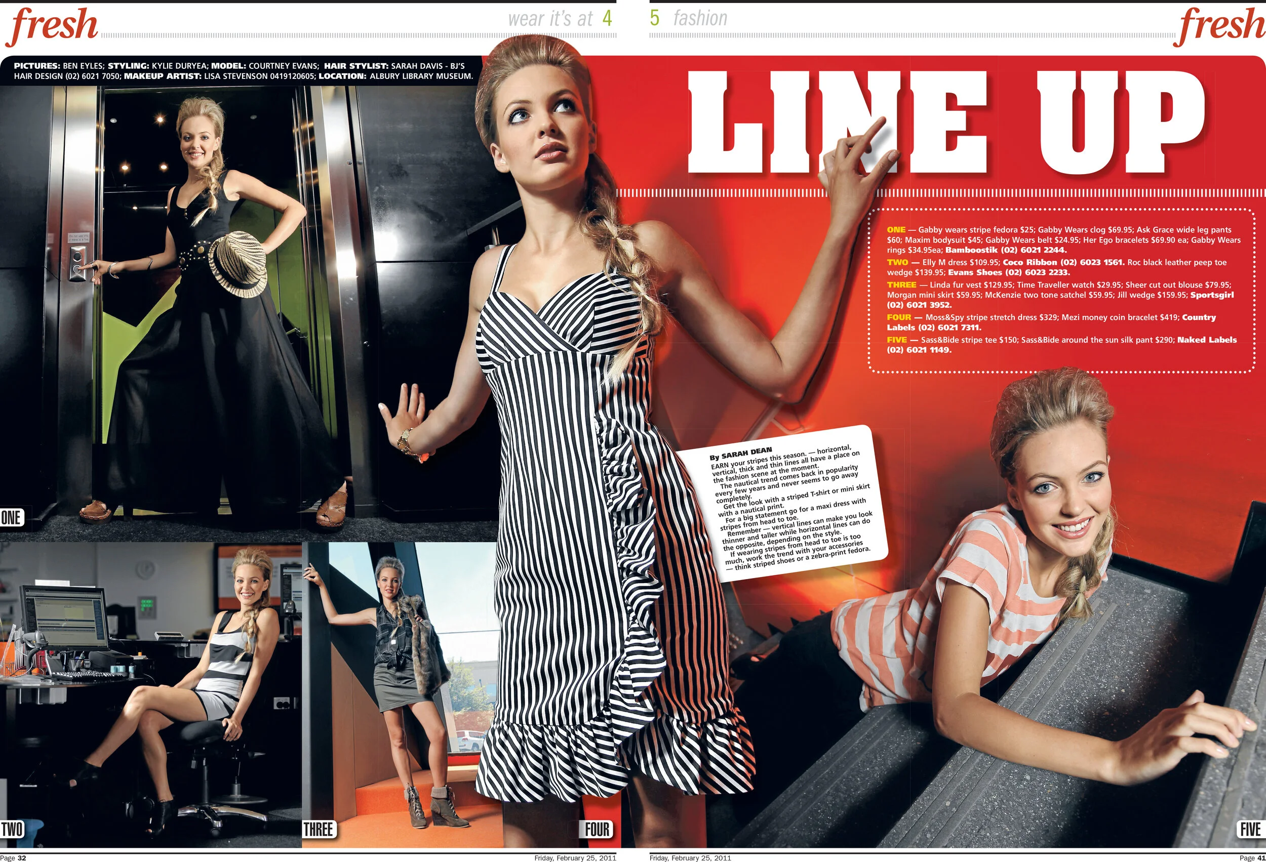
Shooting the seasonal fashion spread for the Border Mail was a real honour. It always involved working with a team including hair and make up artists, a stylist and model. The location was nearly always a public space, and the shoot was nearly always in the middle of the day. All of these things lead to considerable photographic challenges. Despite that, it was very rewarding work. It was always great to sit down with the page designer and comb through the images I shot. As you can see from below, all sorts of deep-etching and layering techniques were often used to mingle text and images to create dynamic designs.
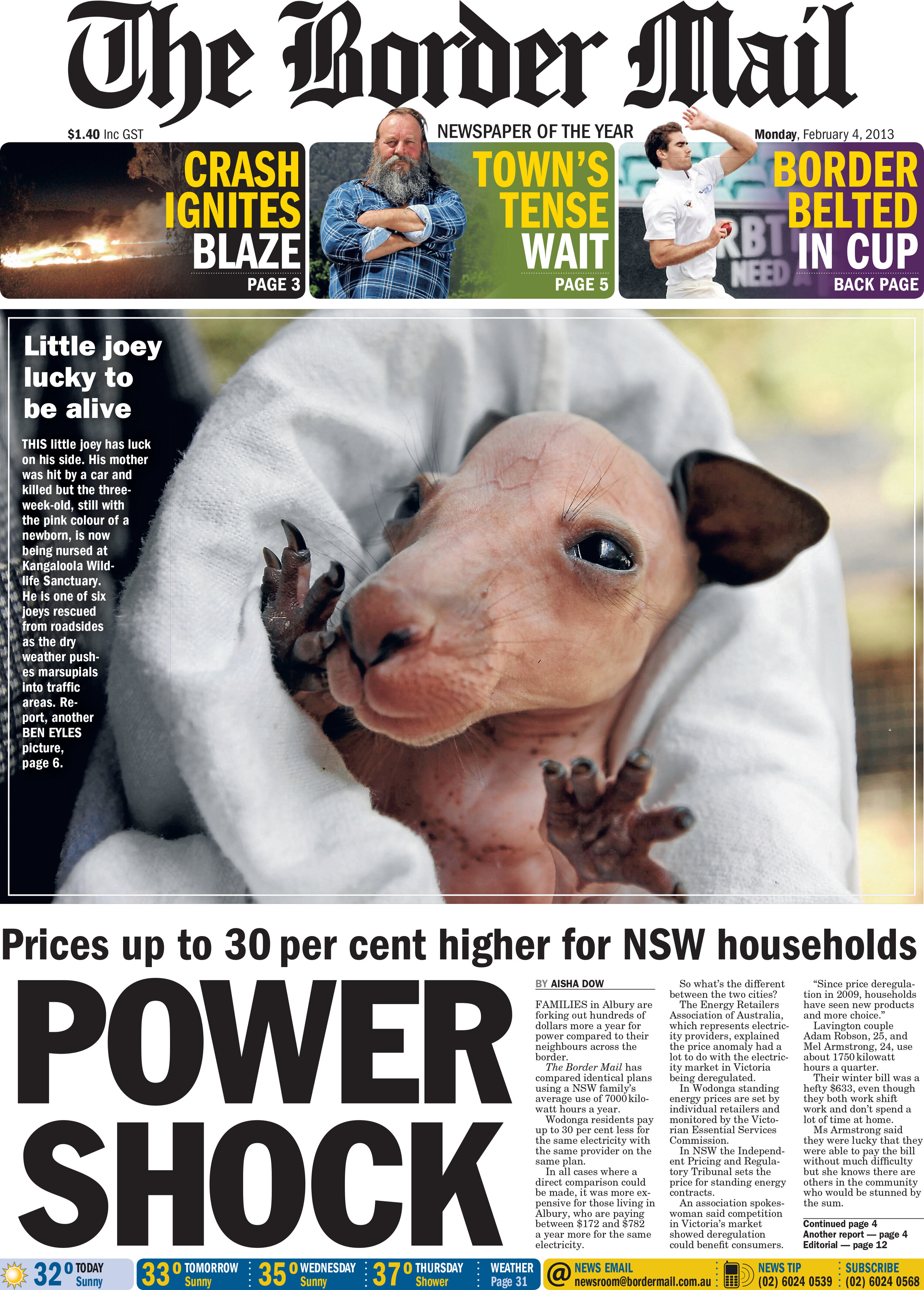
Photographing animals is challenging enough. But having to create a composition that is close up on the animal, and sometimes including a human is challenging. These moments cannot always be staged. You just have to be ready for them when they unfold in front of you, as you see below with the snake images.
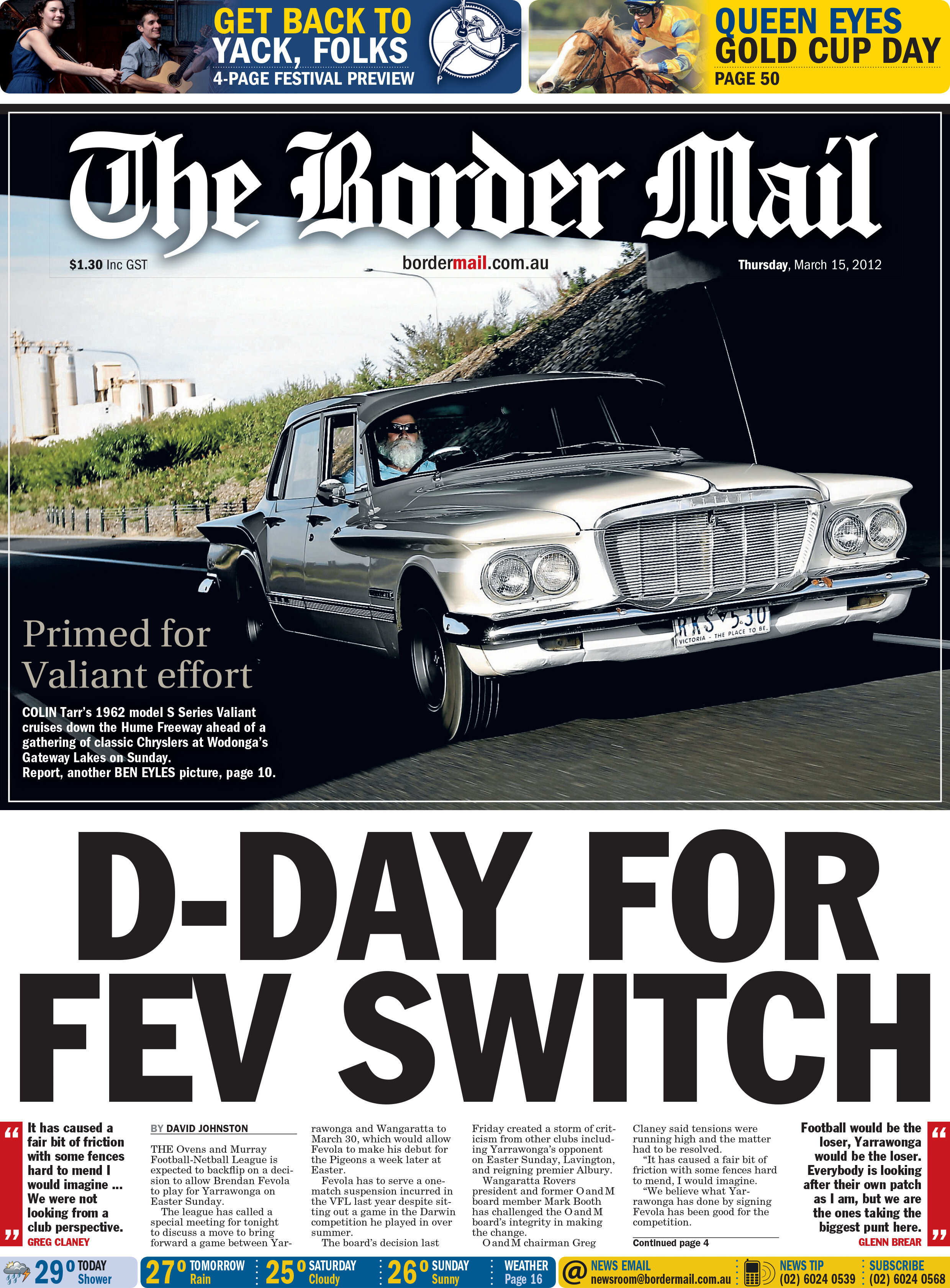
The following layouts are examples of “starting with the art” — the image — and building the page collaboratively from there. Details like tucking the masthead behind the image and using the stark contrast of dark and light drawn from the car image has really created a compelling front page. Underexposing for the highlights has put the car in almost silhouette as it drives beneath the underpass, but as its nose sneaks out it is lit by the sun, and it’s driver is lit by a radio-slaved flash unit hidden on the dashboard. All of this is paired with a very slow shutter speed and shot from another moving car to convey a sense of motion.
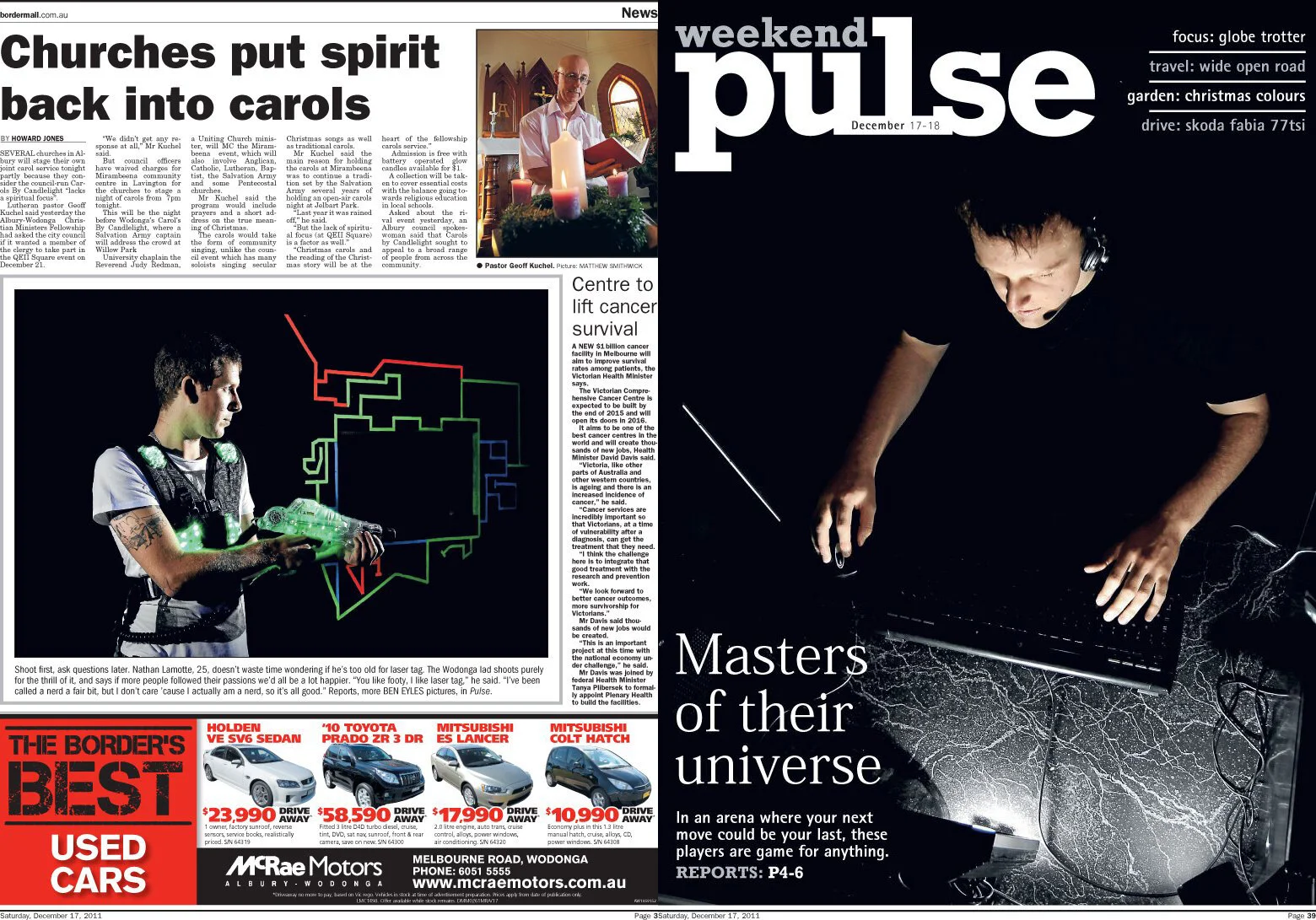
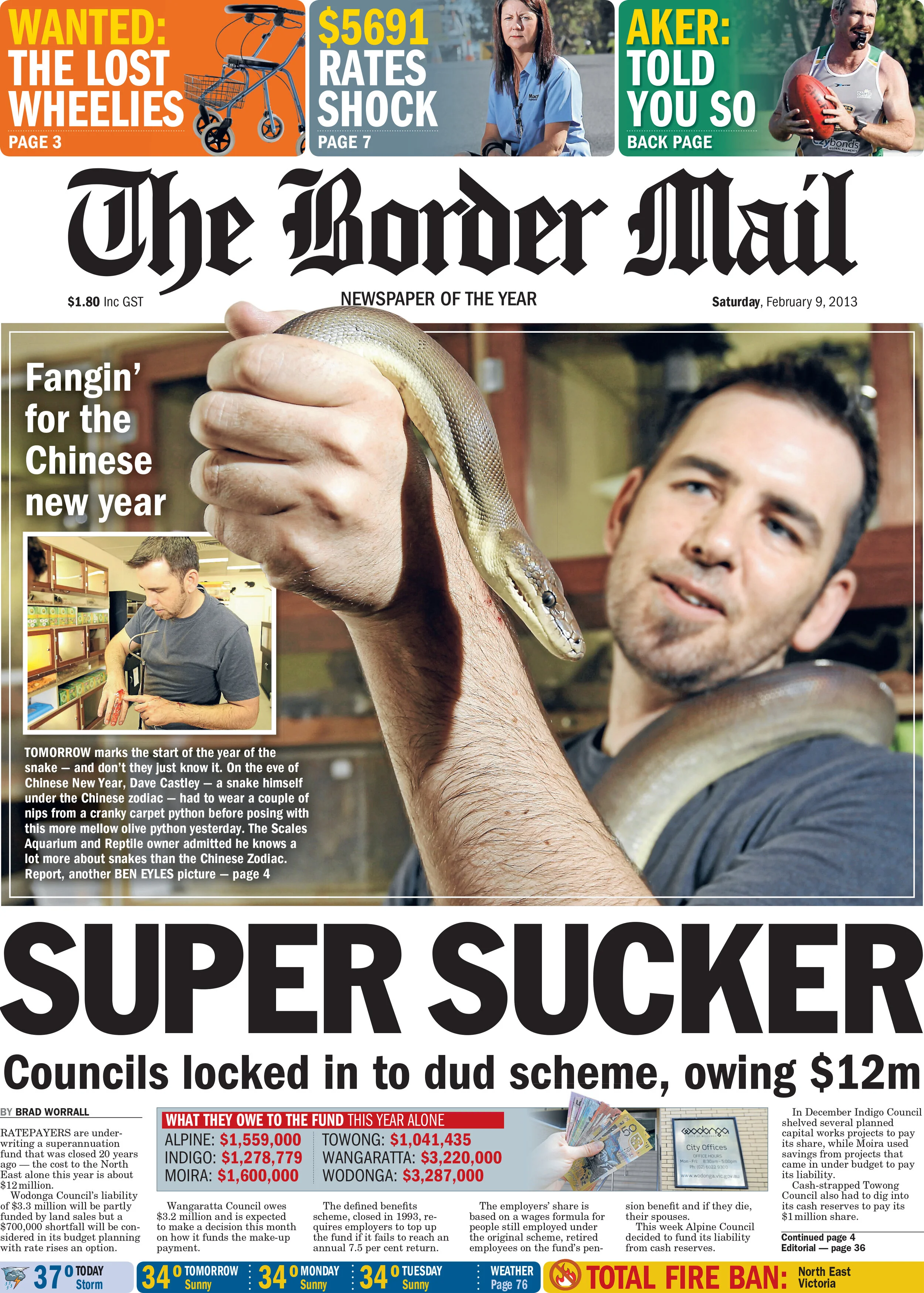
Two fun examples of using a long lens and a shallow aperture to blur the background and help the subjects, and the page text, stand out for the reader.
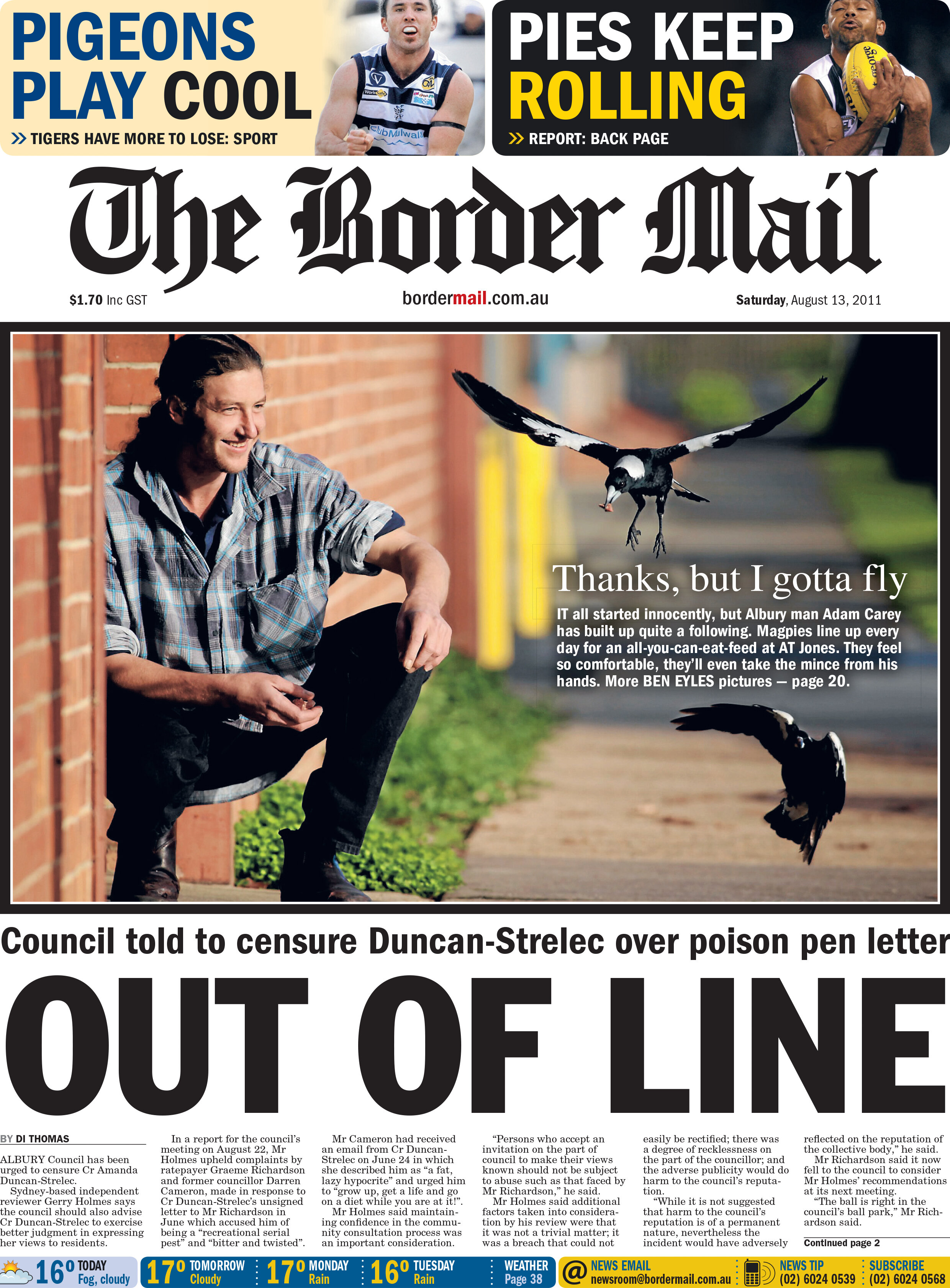
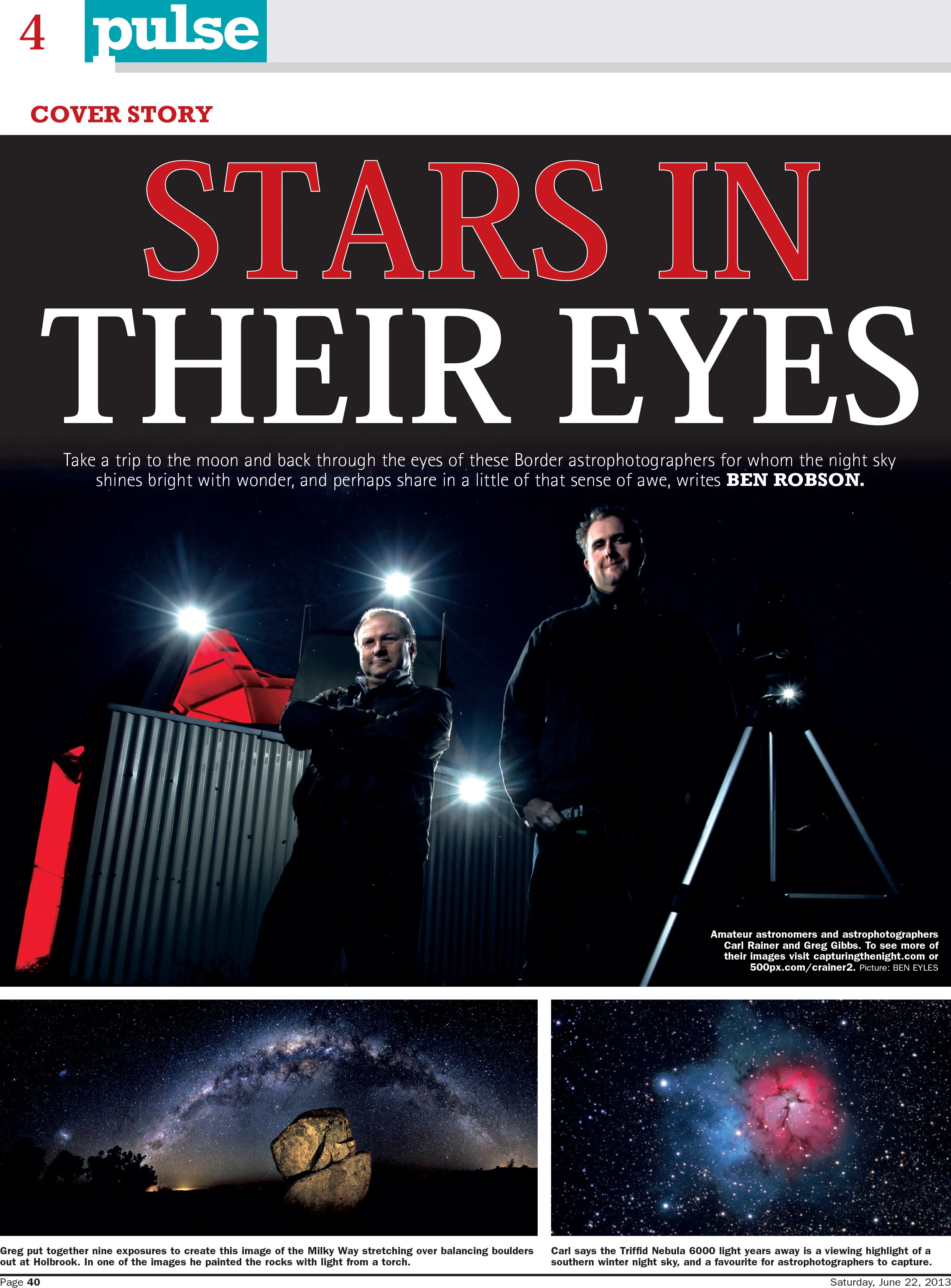
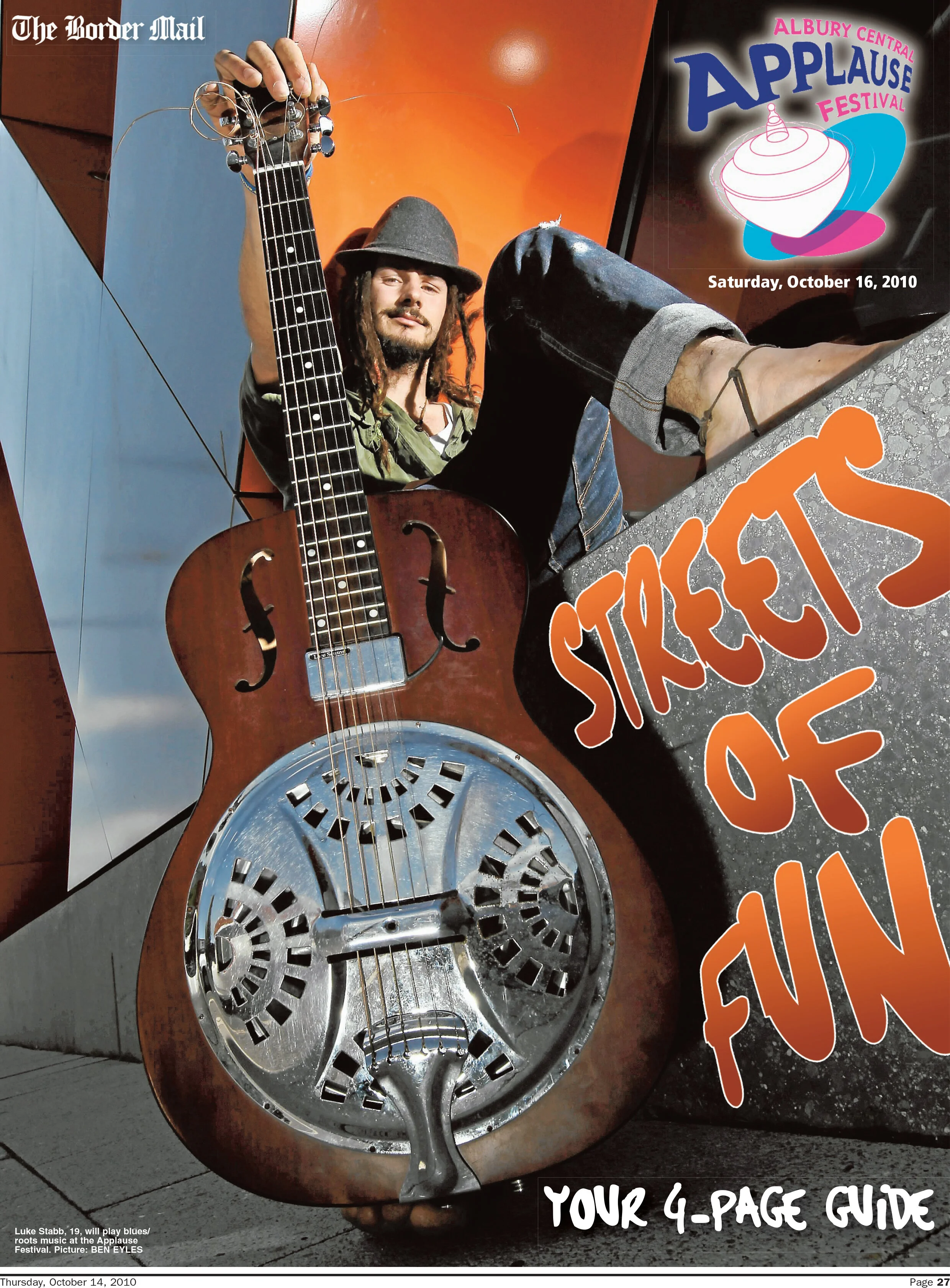
The images below have been shot allowing space in the frame. This allows plenty of room for creative text and header placement.
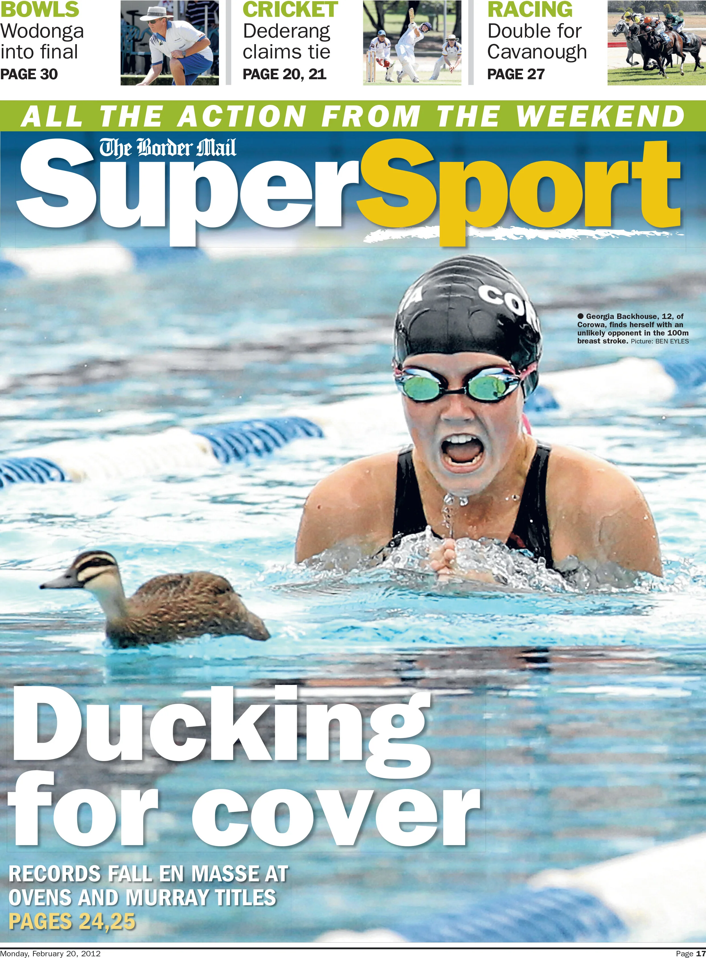
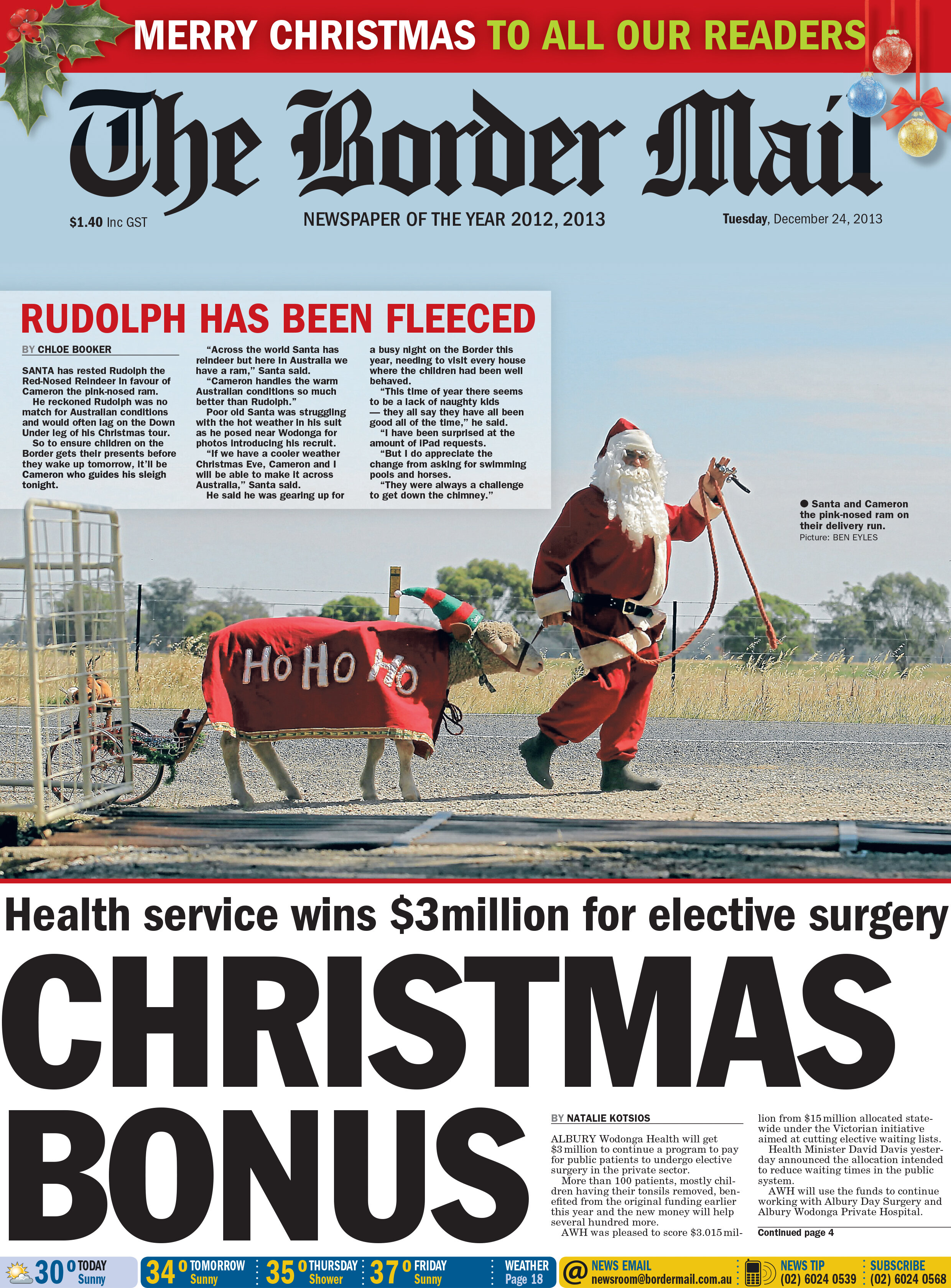
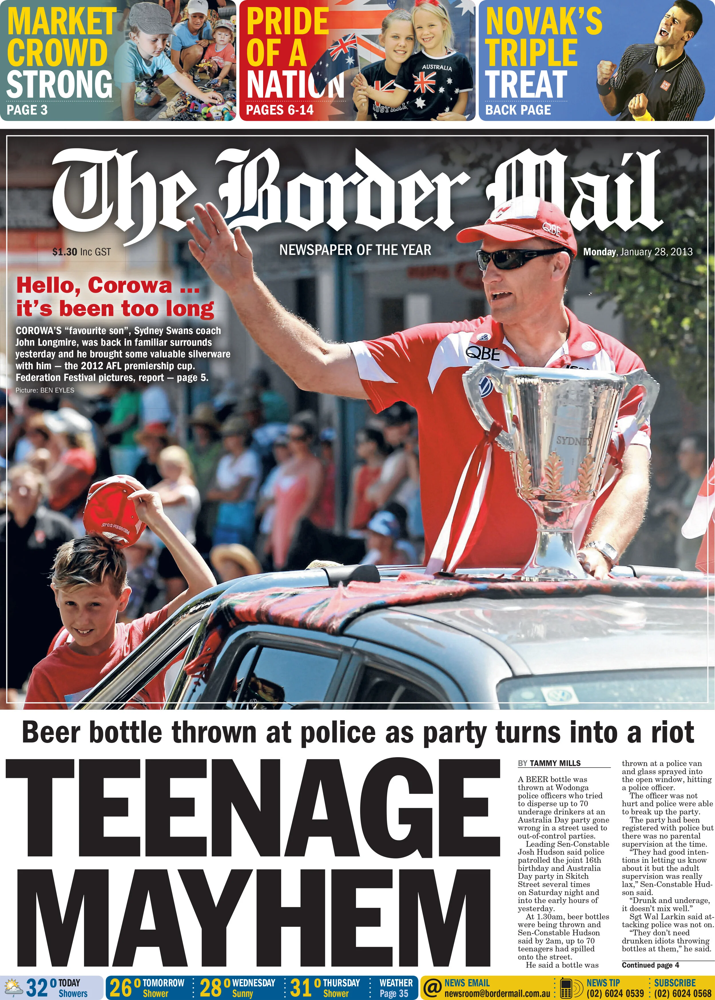
Lastly, here are some examples of how keeping an eye on the world while on other photo assignments, can lead to other interesting images and stories. The opportunity on the left was spotted while walking to the library for another story, the image on the right was captured while covering a swimming carnival.